Friday, 2 May 2014

Sunday, 2 February 2014
Link to webpage
Here is the link for my website, http://www.swfcabin.com/open/1398249390 The video may take a few seconds to load
Friday, 31 January 2014
Thursday, 30 January 2014
Completed Music Video & Footage Clips
Video
\
Here is my completed music video, which I have posted to YouTube, I will be starting to gather feedback now. Now I will be starting to analyse my video.
After posting my video, I realised that I had not posted what I had filmed from an earlier point, so have no posted it.
\
Here is my completed music video, which I have posted to YouTube, I will be starting to gather feedback now. Now I will be starting to analyse my video.
After posting my video, I realised that I had not posted what I had filmed from an earlier point, so have no posted it.
Wednesday, 29 January 2014
Improvements On Feedback
The feedback I had recieved after completing my second draft was mostly positive, however, there was one clip that my audience were not very fond of, which was my artists crying at the end and rubbing her face, so to please my target audience, I will act on their feedback, and replace this part of the video.
 After watching my video, and enlarging it on YouTube, I can see how this looks to my audience, they are right, it does not look very authentic.

This is one of the clips I have decided to use, it refers back to earlier in the music video, where my artist was burning the image of him. I think this will show continuity in more story line, as I have used the same shot but from a different angle, I also think this fits with the lyrics as she says 'YOU' which is addressed at him, therefore her staring at the image, is ironic. I have slowed down this clip, as it makes a really nice effect, as my artists hair is being blown in the wind, I will also need to adapt this clip to black & white, making it fit in with the rest of the video.
 I have also used the same technique here, referring back to an earlier part of the music video. There are two other reasons that I have chosen to use this clip here:
1. The artist refers to walking away in the lyrics.
2. As it is the end of the song, this connotes that she is leaving, it also connotes that she is walking away from the heartbreak.
1. The artist refers to walking away in the lyrics.
2. As it is the end of the song, this connotes that she is leaving, it also connotes that she is walking away from the heartbreak.
Construction Of Music Video
When making my music video, I used Adobe software Premier Pro, where I learnt loads of new skills, as I had never before experimented with this software. At first the process was rather grueling, and I struggled getting to grips with the basic concepts of the software, but as time went on, I learnt the basic and some more advanced skills in order to produce a music video.
The first step I took in regards to the construction of my music video, was adding my mp3 clip, to my timeline, I downloaded my song from a YouTube converter, as I had no other resources in school.
I placed the song, on the audio layer of my timeline, so it was the main source of sound for my video.
 The next process was to add my video clips into my timeline, I had several layers on my timeline which enabled me to insert my videos, as I used some to layer eachother. However I decided to use Video layer 1 as my main source for my clips. Having more than one layer, allowed me to keep my footage more organised. When adding my clips, I had to make sure that the miming was in sync with the music, that is why I chose to add the song first, as it was easier to adapt the footage to the music, that then song to the clips.

After organising the clips into a good systematic order, I had to make the video look authentic, my first step was to start adding effects to my video, the most frequently used effect, was where I reduced the opacity of my two clips to 50% then placed one on top of the other, this allowed both clips to 'ghost eachother' I think this was a good aspect for my video, as its one scene, that tells two stories, so I think that is a good feature for a music video to have.

As you can see from the image above, both clips are layered on top of eachother, and the opacity is reduced to 50% in the effects tool bar, the result of these two effects are featured in the video on the right hand side.
Another important aspect of my video, was making sure that it ran smoothly, and did not look glitchy, so to sucessfully do that, I had to add transistions to several clips, a transition can be placed at the beginning or the end of a clip. Most of the transitions that I used were 'dissolves' being cross or additional. Here is an example:
 As you can see from this printscreen, there was three clips of my artist on one scene, but by adding a transitionto each of the clips, it allows them to fade out at different times, this is shown also on my timeline.
The first step I took in regards to the construction of my music video, was adding my mp3 clip, to my timeline, I downloaded my song from a YouTube converter, as I had no other resources in school.
I placed the song, on the audio layer of my timeline, so it was the main source of sound for my video.
The next process was to add my video clips into my timeline, I had several layers on my timeline which enabled me to insert my videos, as I used some to layer eachother. However I decided to use Video layer 1 as my main source for my clips. Having more than one layer, allowed me to keep my footage more organised. When adding my clips, I had to make sure that the miming was in sync with the music, that is why I chose to add the song first, as it was easier to adapt the footage to the music, that then song to the clips.After organising the clips into a good systematic order, I had to make the video look authentic, my first step was to start adding effects to my video, the most frequently used effect, was where I reduced the opacity of my two clips to 50% then placed one on top of the other, this allowed both clips to 'ghost eachother' I think this was a good aspect for my video, as its one scene, that tells two stories, so I think that is a good feature for a music video to have.
Another important aspect of my video, was making sure that it ran smoothly, and did not look glitchy, so to sucessfully do that, I had to add transistions to several clips, a transition can be placed at the beginning or the end of a clip. Most of the transitions that I used were 'dissolves' being cross or additional. Here is an example:
Tuesday, 28 January 2014
Construction Of Inside Sheet


The final aspect of creating my lyric sheet, was to actually insert the lyrics, instead of copy and pasting them, I decided to type them out myself, I decided to read the lyrics from a well know and trusted lyrics websites, to ensure that there would be no type errors on my lyric sheet, so I could maintain a professional standard. Underneath is my finished lyric sheet, as you can see, I have postitioned the writing around the outskirts of my artists body, this connotes that they are protecting her, from the hurt that is in the lyrics.

Finished Lyric Sheet:


Feedback:
Here is a selection of feedback I have chosen to import.
.bmp)
.bmp)
.bmp)


Construction Of The Disk


Spine For CD Case


Here is a print screen of the outside of my DigiPak placed on a template, the template fits the same dimensions as my front and back cover, which I then inserted my spine into the middle, as I couldn't find a template with a section for the spine, that complied with the dimensions of my album. As you can see, there is a continuous theme of the crumbled paper background, the main reason for this was to make it a relation to my website, to show this is a current album, and the website is current. I have also used a black and white theme on all theree pieces, as I think this connotes how my artists feels, I also think it fits with the names of the songs that are located on my back cover. The most eye catching aspect of my DigiPak, is my 'filter effected' images.
Construction Of Back Cover

I have started to construct my back cover for my artists album, I have used the same dimensions as the front cover,which is 4.75 inches x 4.75 inches, they have to be the same size, in order to create a fully authentic cd case. I have chosen to use an image where my artist is looking away from the audience, as I think this contrast with looking forward, on the front of the album, therefore she is looking backwards on the back of the album. To ensure there is continuity in my album, I have used the same filter and black and white effect, so I have a black and white colour scheme. To fit the conventions of an album, I will need to add 10-12 song titles that are featured on the album, and also a barcode that will allow the album to be sold in the shops.

ot connot happiness, but the sadness of my artist, I think my image also portrays this, as my artist is looking away from the audience, this makes her seem vulnerable.

Here is my albumwith my complete list of songs, I have chosen a normal sans serif font for this, as it appears that a lot of artists use this on the back of their albums, I think this is because it is an easy to read font. I have chosen all of the song names myself to avoid copyright, if there is any songs with these names, it was not intentional, so therefore there was no copy right intended. I now need to add a barcode to my album,

Here I have added my barcode, which I got off Google, however I searched it as copyright free, the barcode will allow my album to be sold in shops all around the world. I have now noticed that it seems that I have forgotten to add my background to my album, therefore that doesn't fit in with the continuity of my album, so I will have to go back and add this.

Here I have added the background onto my back cover, I had some difficulty adding this in so late on in the progress of this piece, so therefore I had to use the 'magic eraser' tool, to go round the artists head, without cutting out bits of her head, I used a blur effect, so that it would add a glow around the outside of my artist. However, I can't change the background behind the barcode, as the linings are really small.

Here is my completed back cover for my album, where I have continued the theme from the front of my album, I have tried to keep my backcover to a minimum, as I didn't want it to look crammed, I was going for a more authentic and professional look, to connote the classiness of my artist. The songs all follow the semantic of being heart broken, which fits in with my artists song from my music video and also the album name.
Monday, 27 January 2014
Construction Of Front Cover


I have decided to name my album 'broken' as I think it is a good representation of how my artist is feeling, after the song 'Wrecking Ball.' I created my title on www.dafont.com, where I print screened the image, and then cropped it in word, whilst making the image transparent, so it was coherent with the background. I used this font, as it is each letter is from news paper clippings, which have been broken away individually, therefore I thought this would be an appropriate font to use for my album, the text is also black and white to fit in with my image. As you can see, I have written my artists name in the corner, but I don't think that looks very authentic, as it is in just a plain sans serif font, and is not very eye catching, so I will have to re-do that.


Tuesday, 21 January 2014
Actor and Film Location.
For my music video, I have chosen to do the song Wrecking Ball by Miley Cyrus, this video has caused quite a shock in the media recently, and i'd like to put my own twist on it. For the role of my main artist, I will be using a female, Jess Nemeth, I also plan to film this video inside and outside, as I am still unsure, I will be experimenting, to see what fits in.. My story line will be a woman, who has been emotionally wrecked, so it will be a narrative video, with some performance features. I will be telling the story of how she is broken, but she will also be lip syncing with great emphasis on how upset she is. To make my video look authentic the lip syncing needs to look realistic and in time to the music.
Costumes:
I think that I will have to use a variety of different outfits for my artist...
1. All black outfit, this is to connote that my artist is in a dark place in her life, and that she is really upset.
2. All white outfit, this is to show that there is a light at the end of the tunnel, and there is love after heart break.
3. Evening dress, this is to promote my artist.
This page was a draft that I had forgotten to post!
Costumes:
I think that I will have to use a variety of different outfits for my artist...
1. All black outfit, this is to connote that my artist is in a dark place in her life, and that she is really upset.
2. All white outfit, this is to show that there is a light at the end of the tunnel, and there is love after heart break.
3. Evening dress, this is to promote my artist.
This page was a draft that I had forgotten to post!
Wednesday, 15 January 2014
Second Ancillary Task - Album Cover
I have decided to create an album cover for my artist, which I will then incorporate onto my homepage for my website. So I have started looking into album covers, the first fact that I found was album covers are roughly 4.75 inches by 4.75 inches. I will now start to analyse other artists album covers before I start the initial design process of my cover.

The next album I have chosen to analyse is pop singer 'KE$HA' this keeps with the same conventions of the Lady Gaga album, the artists face is the main attraction on the page, it is fairly big, and extenuated, however, I feel that this album cover is quite ferocious, the image is harsh not smooth, and the font chosen is pointed like spikes. I think this fits in with the album name 'Animal' so the idea of the cover is to be fierce, I will also keep this in mind when making my own album cover, this is emphasised by the lightening bolt that has been added to her face, I also think this connotes the shock that she has caused as an artist.

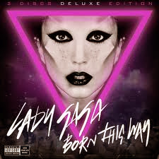
This is the album cover of a Lady Gaga CD, I have chosen to look at this one because as she is known for her outlandish behaviour I wondered if her album cover would also represent this. The most eye catching part of the cover is the artists face, which has been well edited so it's very defined, it almost looks 3D, this is a good way to make the cover eyecatching, therefore visually appealing to her target audience. She has also chosen harsh black makeup, to emphasise her facial features. Her face is covered by an upside down triangle, which is associated with the 'illuminati.' The background is a purple background, which has been put on a gradient so desolves into a lighter purple. The bottom of the cover has images of lady gaga's head. In the bottom left hand corner, is a 'parental advisory' sign, this is used on many explicit videos, but in this case I feel that it used to connote the extremism of her personality.The only writing is the artists name, and the name of the album is one of her songs, so I will bare this in mind when designing my album cover. They have chosen a rather girlish font, for a female artist.
The next album I have chosen to analyse is pop singer 'KE$HA' this keeps with the same conventions of the Lady Gaga album, the artists face is the main attraction on the page, it is fairly big, and extenuated, however, I feel that this album cover is quite ferocious, the image is harsh not smooth, and the font chosen is pointed like spikes. I think this fits in with the album name 'Animal' so the idea of the cover is to be fierce, I will also keep this in mind when making my own album cover, this is emphasised by the lightening bolt that has been added to her face, I also think this connotes the shock that she has caused as an artist.
Wednesday, 4 December 2013
Posted feedback on YouTube video.

Monday, 2 December 2013
Exporting Videos To YouTube

Feedback On First Draft Youtube Video

Friday, 29 November 2013
Album Cover
I have been playing around, using pic monkey, to edit my photo, and mess around with different fonts, here I what I have come up with:
\
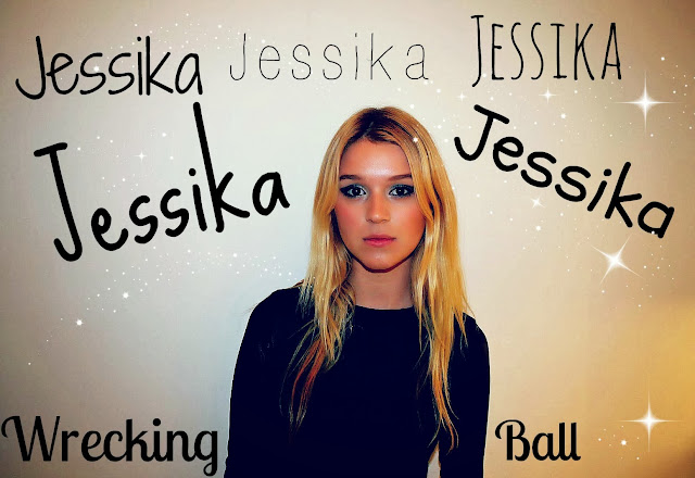 For my artists name, I have stuck to sans serif fonts, so that they are easily readable, and seeing as I have used a playful font on my webpage for the artists logo, I feel that I should carry on the consistency on my album, as many famous people have a repetitive brand.
\

Ancillary Task 2 - Album Cover
For my second ancillary task, I have chosen to do an album cover for my artist 'Jessika' this will also link in with my web page, where I will be displaying my album cover, and offering a 'buy now' button which will be linked to iTunes. I have taken 2 photo shoots so far, the second one being the most successful as the first one, my artist was shown wearing black socks, and didn't look like an authentic picture that would have been taken of a well known artist. I will post the most likely pictures below:
 I really like the image, as it refers back to a shot I used in my music video, so this would be suitable for an album cover. I also think that it portrays quite a seductive look, which doesn't intertwine with the lyrics of my song, therefore doesn't really go with the theme of my music video. If I was to use this image, I would edit out the background, and put her above something that is more significant to the song.
 I think this picture is really direct, and where she is looking at the camera, it is like she is looking into the eyes of an audience, which would be a welcoming image to have on the front of an album, in terms of getting people to purchase it. I also think its a really simple and subtle picture, which links with the message behind my video, showing that the partner that she has split with, has stripped her and left her empty, the blank expression on my artists face connotes that. I also think the quality of the picture is nice, with her face looking airbrushed, and with some editing has the potential to like quite professional. In this picture, I have given my artist a dark look, dressing her in dark colours, which is contrasted by the white wall behind her, so that she stands out. I have also gone for a subtle colour foundation, however, using dark smokey eyes, to show her upset and anger towards this man.
 I chose to make my artist take a picture like this, as it shows her as vulnerable, I chose to use a midshot, so it didn't reveal her whole body. This connotes that she can't give her full self to anyone, which fits the lyrics within my music video. I also think that with her looking away from the camera, makes her look very secluded, and trapped within herself, I think this creates an authentic look into how my artist is feeling inside, I also think it's a relatable feeling for my audience to be involved in. If I was to use this picture, I would add a different colour into the background, as I think the different shades that are already present on the wall of the picture, have the potential to create a really good effect. I would edit this in pic monkey, and further it in Adobe Photoshop.


Subscribe to:
Posts (Atom)